



Gloss, Satin AQ, or Matte Uncoated: Choosing Paper for Catalogs and Booklets
A catalog can have sharp photos, tight copy, and a smart layout, and still feel wrong in the hand. Pages that glare under office lights, colors that look flat, or a cover that smudges after one trade show: these problems usually trace back to one decision. The paper.
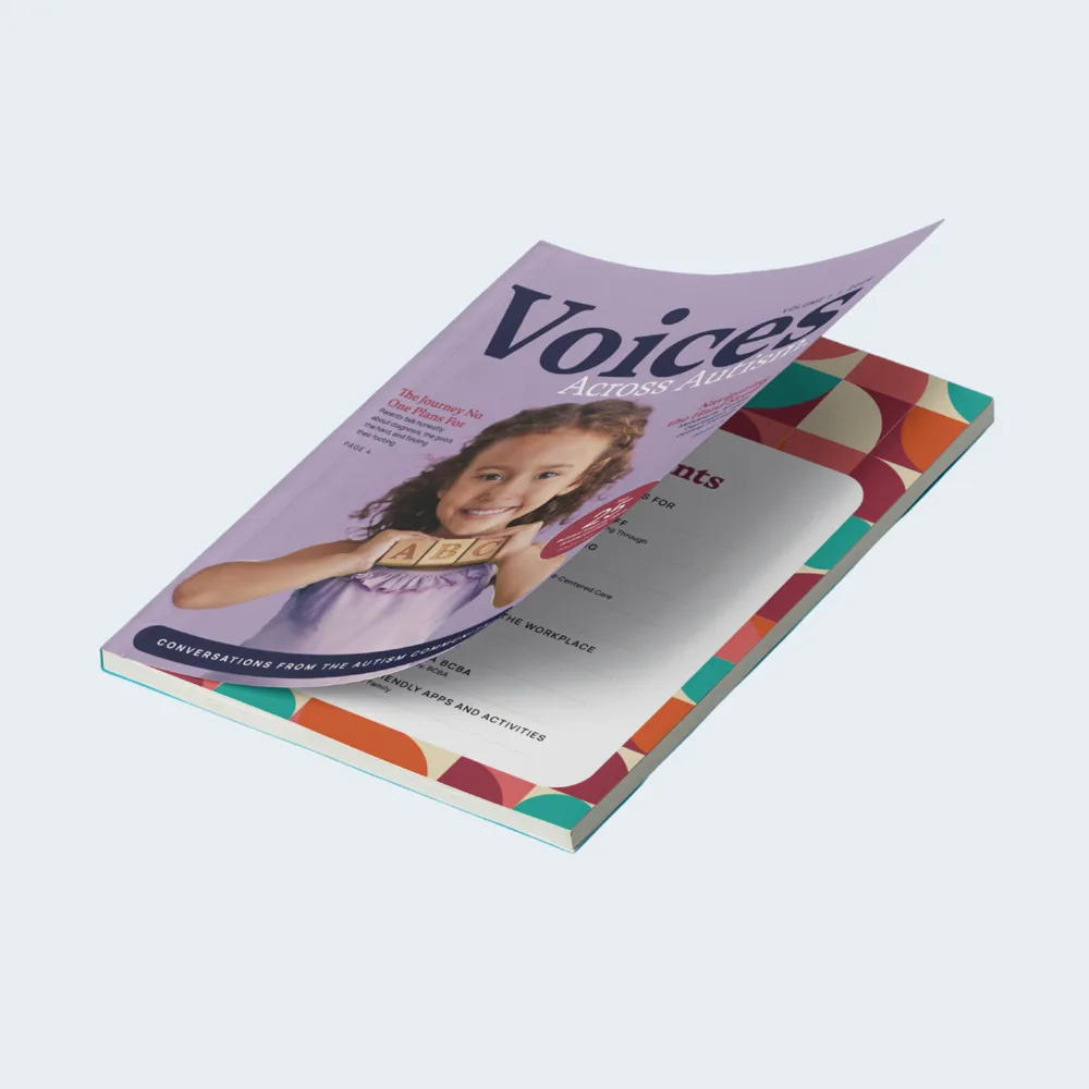
In our experience printing booklets and catalogs for small businesses, agencies, and independent professionals, the paper finish gets far less attention than the binding. We already walk through binding and page count in our guide to saddle stitch vs. perfect bound cost. This article covers the other half of the decision: choosing between gloss, satin AQ, and matte uncoated paper so your booklet looks and reads the way you intend.
The Quick Answer: Which Booklet Paper Finish Fits Your Project?
If you only have a minute, start here:
Gloss: best for product catalogs, lookbooks, real estate and menu-style books where photos and bright color do the selling.
Satin AQ (dull book with satin aqueous coating): best for short, polished booklets that mix photos and text, such as service guides, company overviews, and leave-behinds.
Matte uncoated: best for text-heavy books that people read closely or write in, such as training manuals, event programs, workbooks, and price guides.
The rest of this guide explains why, where each finish can let you down, and how page count and mailing affect the choice.
What Gloss, Satin AQ, and Matte Uncoated Actually Mean
Print terms get used loosely, so it helps to separate two things: the paper's surface and any coating added on press.
Paper Finish vs. Press Coating
The paper finish is built into the sheet at the mill. Sappi, a major coated paper mill, groups coated papers into four basic finishes: gloss, dull, silk, and matte. Gloss is the shiniest, and matte is the flattest.
A press coating is a separate layer applied after the ink goes down. AQ is short for aqueous, a water-based coating that protects the printed surface from scuffs and fingerprints. A satin AQ adds a soft, low-sheen protective layer rather than a high shine.
With those two ideas in place, the three booklet options make more sense:
Gloss pairs a glossy sheet with a shiny printed surface.
Dull Book + Satin AQ pairs a low-sheen dull sheet with a satin protective coating on top.
Matte Book Uncoated uses a flat matte sheet with no press coating added, so nothing sits between the reader and the page.
One common mix-up: designers often treat "matte" and "uncoated" as the same thing. Sappi points out that they are not. In our product name, "uncoated" refers to the absence of an added press coating, not to the paper itself.
Why the Same Photo Looks Different on Each Sheet
Ink sits differently on each surface. On gloss, more of the ink stays on top of the sheet and reflects light, so colors look deeper and photos look crisper. On dull and matte surfaces, light scatters, so the same image looks softer and calmer, and text is easier on the eyes. Neither is better in general. The right choice depends on whether your booklet sells with images or informs with words.
Gloss Catalogs: Built for Photos and Color
Gloss is the finish most people picture when they think of a retail catalog. Our gloss catalogs print full color on both sides of 100lb gloss text, in 8.5 x 11 inches, with page counts from 8 to 64 and the option of a 14pt cover.
Where Gloss Works Best
Gloss earns its place when images carry the message. We often see it chosen for:
Product catalogs where shoppers compare items by photo
Real estate and property books with interior and exterior shots
Food, hospitality, and venue books where color sells the experience
Portfolios for designers, contractors, and photographers
The shiny surface also feels familiar and premium to many buyers, which helps a catalog look current on a showroom counter.
Where Gloss Falls Short
Gloss reflects light. Under bright overhead lighting, such as a convention hall or a clinic waiting room, long blocks of text can be tiring to read. Gloss also shows fingerprints more readily than flatter finishes, and ballpoint pens tend to skip on it. If you expect customers to circle items or fill in an order form, plan for that page differently or consider a flatter finish.
Dull Book + Satin AQ Booklets: The Balanced Middle
Satin AQ sits between gloss and matte. Our dull book + satin AQ booklets print full color on 100lb dull book, inside and cover, with a satin aqueous coating, in 8.5 x 11 inches and 4 to 16 pages.
Where Satin AQ Works Best
This is the finish we suggest most often when a client is unsure. Photos keep good color and detail, while the low sheen keeps text comfortable to read. The satin coating also adds a layer of scuff protection, which matters for booklets that get handed out, carried in bags, and passed around a table. It suits:
Company overviews and capabilities booklets
Service guides for medical, dental, and therapy practices
Agency pitch books and proposal leave-behinds
Short product guides that mix specs with photography
Where Satin AQ Falls Short
The main limit is length. At 16 pages maximum, this option fits a focused booklet, not a full catalog. If your content runs longer, look at gloss or matte, or step up to a perfect bound book. Because the inside and cover share the same 100lb sheet, the cover also feels lighter than a dedicated cover stock.
Matte Book Uncoated Booklets: Built for Reading and Writing
Matte is the quietest of the three finishes. Our matte book uncoated booklets print full color on 100lb matte book inside, with a 100lb dull book cover and no added coating. They come in 8.5 x 11 or the more portable 5.5 x 8.5 size, from 8 to 52 pages.
Where Matte Uncoated Works Best
With almost no sheen, matte pages read comfortably under any lighting, and they take a pen easily. That makes this finish a strong fit for:
Training manuals and onboarding guides
Event and conference programs that attendees mark up
Workbooks, intake packets, and parent or patient guides
Price guides and spec books that are mostly text and tables
The 5.5 x 8.5 size is worth a look here. It slips into a bag or folder and feels more like a handbook than a sales piece.
Where Matte Uncoated Falls Short
Photos print softer and colors look more muted than on gloss, so very bright brand colors may not pop the way they do on screen. Without a protective coating, the pages also show wear sooner if the booklet is handled heavily. For a photo-led catalog, matte is usually the wrong tool.
Gloss vs. Satin AQ vs. Matte Uncoated: Side-by-Side Comparison
Gloss Catalogs | Dull Book + Satin AQ Booklets | Matte Book Uncoated Booklets | |
Inside paper | 100lb gloss text | 100lb dull book | 100lb matte book |
Cover | Self cover or 14pt cover | 100lb dull book | 100lb dull book |
Coating | Gloss finish | Satin aqueous | None |
Sizes | 8.5 x 11 in | 8.5 x 11 in | 8.5 x 11 or 5.5 x 8.5 in |
Page counts | 8 to 64 | 4 to 16 | 8 to 52 |
Sheen | High | Low | Lowest |
Photo impact | Strongest | Strong | Softest |
Text readability | Good | Very good | Best |
Easy to write on | No | Somewhat | Yes |
Best for | Product catalogs, portfolios | Overviews, service guides | Manuals, programs, workbooks |
All three are saddle stitched with long-edge or short-edge binding. For books from 28 to 92 pages, our perfect bound catalogs use 80lb gloss book inside with a 10pt cover and a flat spine.
Four Questions to Ask Before You Choose a Booklet Finish
When clients call us undecided, these four questions usually settle it within a few minutes.
1. Does Your Booklet Sell With Images or Inform With Words?
Look at your page layouts. If most spreads are photo-led with short captions, gloss will reward you. If most pages are paragraphs, lists, and tables, matte will be easier to read. A fairly even mix points to satin AQ.
2. Where Will People Read It?
Think about the lighting. Trade show halls, retail counters, and medical offices tend to have strong overhead lights that create glare on shiny paper. A booklet read at a desk or a dining table is more forgiving. The brighter the setting, the more a low-sheen finish helps.
3. Will Anyone Write on the Pages?
Workbooks, event programs, order forms, and checklists all need a surface that takes ink. Matte uncoated is the safest choice here. Satin AQ can work for light notes, while gloss is the least friendly to a ballpoint pen.
4. How Many Pages, and Will You Mail It?
Page count narrows your options fast. Satin AQ tops out at 16 pages, matte at 52, and gloss at 64. Past that, perfect binding takes over.
If the booklet will go through the mail, weight matters too. USPS notes that shape and weight determine postage, and USPS Marketing Mail flats over 4 ounces are priced with a per-pound charge on top of the per-piece price. Heavier sheets and extra pages add up across a large mailing, so check the finished weight with your mail house before you lock in the spec. Our branded catalog envelopes are sized for 9 x 12 mailings if you need a matching outer piece.
Timing can play a role as well. Standard turnaround is about 4 business days for satin AQ, 4 to 5 for gloss, and 7 for matte uncoated. If you are working toward an event date, our guide to rush vs. standard turnaround can help you plan.
File Prep Tips That Help Any Paper Finish Print Well
The finish sets the tone, but your files decide how good the result looks. In our experience printing thousands of multi-page jobs, these steps prevent most surprises:
Design in CMYK, not RGB. Screen colors are brighter than ink can reproduce. Converting early means fewer shocks when the proof arrives, especially on matte.
Use images at 300 DPI or higher. Low-resolution photos look soft on any sheet, and gloss makes the problem easier to see.
Lift dark photos slightly for matte. Ink spreads a little more on flatter surfaces, so deep shadows can fill in. A small brightness lift keeps detail.
Build page counts in multiples of four. Saddle stitched books are made from folded sheets, so every sheet adds four pages, including the cover.
Keep text away from the spine and trim. Leave a safe margin so nothing important gets lost in the fold or cut off.
Ask for a proof. Reviewing a proof is the best way to confirm color and layout before the full run.
Conclusion
Choosing paper for a catalog or booklet comes down to what the pages need to do. Gloss gives photos the most color and punch, which makes it the natural pick for product catalogs and portfolios. Dull book with satin AQ balances image quality, readability, and scuff protection in a short, polished booklet. Matte book uncoated reads the most comfortably and takes a pen, which suits manuals, programs, and workbooks. Factor in page count, lighting, and mailing weight, and the right finish usually becomes clear.
Brochure King prints booklets and catalogs for businesses, agencies, and professionals across New Jersey, New York, and Pennsylvania, with shipping nationwide.
Email orders@brochureking.com, call 732-660-KING (5464), or request a quote today, and our team will help you choose the paper, finish, and binding that fit your project.
Frequently Asked Questions
Is gloss or matte paper better for a catalog?
Gloss is usually better for a product catalog because it makes photos and colors look sharper and more vivid. Matte is better for a text-heavy catalog, such as a price guide or spec book, because it reduces glare and is easier to read. If your catalog mixes photos and text evenly, a satin or dull finish offers a middle ground.
What is satin AQ coating on a booklet?
Satin AQ is a satin aqueous coating: a water-based protective layer applied over the printed pages. It adds a soft, low-sheen look and helps protect the booklet from scuffs and fingerprints. On a dull book sheet, it keeps photos looking clean while text stays easy to read.
Can you write on glossy booklet paper?
Writing on gloss is difficult because ballpoint pens tend to skip or smear on the shiny surface. If people will fill in forms, take notes, or mark up pages, matte uncoated paper is the most reliable choice. Satin AQ falls in between and handles light notes better than gloss.
Dana Whitfield writes everything you need to know about printing, from choosing a stock to signing off the proof.
More articles by Dana